

The golden cross — when the 50-day moving average crosses above the 200-day moving average — is one of the most widely watched signals in all of technical analysis. Its bearish counterpart, the death cross, occurs when the 50-day falls below the 200-day. Financial media treats both events as major market signals. Algorithmic systems monitor them. Institutional traders are aware of them. And retail traders are frequently drawn in by the simplicity of the concept.
The reality is more nuanced than the headlines suggest. Golden crosses and death crosses contain genuine information about market momentum, but they also generate late signals, false positives, and traps — particularly for traders who do not understand the context in which these crossovers occur. This guide covers what these signals actually tell you, when they work, when they fail, and how to integrate them with a smart money approach.
What a Golden Cross Actually Represents
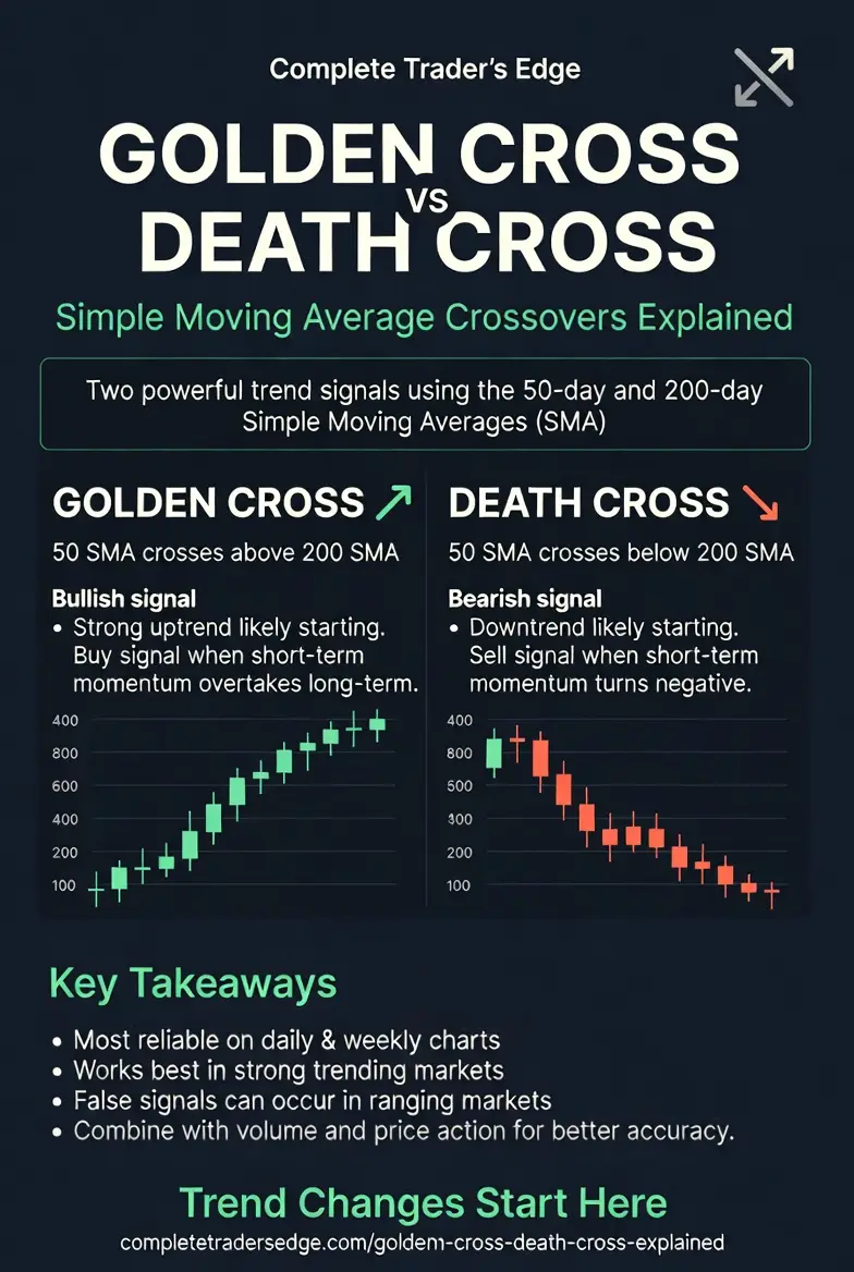
A golden cross is not a prediction. It is a statement about the current state of momentum. When the 50-day moving average (which tracks roughly two and a half months of price action) crosses above the 200-day moving average (which tracks roughly ten months), it tells you that short-term momentum has shifted from negative to positive relative to the long-term trend.
In simpler terms: the market has been going up long enough and strongly enough that recent prices are now above the long-term average. Buyers are in control. The trend has shifted.
This matters because moving average crossovers capture a genuine shift in market dynamics. Institutional capital tends to flow in the direction of established trends. Algorithms that track moving averages begin buying when the 50 crosses above the 200. Portfolio managers who use technical overlays start building positions. The signal itself creates buying pressure — a self-reinforcing mechanism that can extend the move.
The Three Stages of a Golden Cross
Not all golden crosses are created equal. The strength and reliability of the signal depends on the conditions that precede it.
Stage 1 — The Bottom: The 50-day is below the 200-day and still falling. This represents the tail end of a downtrend or correction. The death cross is already in effect and the market is in confirmed bearish territory.
Stage 2 — The Crossover: The 50-day flattens and begins to curl upward, eventually crossing above the 200-day. This is the golden cross itself. The signal is strongest when the 200-day has also begun to flatten or turn upward, indicating that the long-term trend is also shifting. A golden cross where the 200-day is still falling steeply is less reliable — it suggests a short-term bounce within a continuing downtrend.
Stage 3 — The Confirmation: After the crossover, price pulls back and finds support at or above the 50-day moving average. This retest confirms that the new trend has institutional backing. The strongest trends show shallow pullbacks to the 50-day that are quickly bought.
When the Golden Cross Works
Historical data across equities, forex, and crypto shows that golden crosses have positive forward returns on average — but the averages obscure significant variability. The signal works best in the following conditions:
After an extended downtrend or correction. A golden cross that occurs after six or more months of declining prices, where the market has been through genuine capitulation and accumulation, tends to mark the beginning of a significant trend change. The 2020 golden cross on the S&P 500 following the COVID crash was a textbook example.
When volume confirms the crossover. A golden cross accompanied by increasing volume on up days and decreasing volume on down days suggests genuine institutional participation. A crossover on thin, directionless volume is suspect.
When broader market context supports the move. A golden cross on an individual stock while the broader market or sector is in a confirmed uptrend is more reliable than one that occurs in isolation. Multi-timeframe confirmation increases the probability significantly.
When the Golden Cross Fails
The most common failure mode is the whipsaw — a golden cross that occurs during a ranging, choppy market that quickly reverses into a death cross. This happens frequently when the market is moving sideways and the moving averages are flat and close together. In these conditions, random price fluctuations cause the averages to cross back and forth repeatedly, generating signals with no directional meaning.
The second failure mode is the lagging trap. Because moving averages are calculated from past prices, the golden cross always confirms a trend that has already developed. By the time the 50-day crosses the 200-day, a significant portion of the move has often already occurred. Traders who buy exclusively on the crossover may be entering late, with much of the easy money already made.
The third failure mode is the bear market rally. During secular bear markets, price can rally sharply enough to trigger a golden cross — only for the broader downtrend to reassert itself. The 2001-2002 and 2008 bear markets produced multiple false golden crosses before the true bottom was established.
The Death Cross: Mirror Image, Same Limitations
The death cross — the 50-day crossing below the 200-day — generates fear in the same way the golden cross generates hope. Media coverage amplifies the signal, creating selling pressure that can become self-fulfilling in the short term.
However, death crosses have a historically worse track record as actionable sell signals than golden crosses have as buy signals. By the time the death cross is confirmed, much of the selling has already occurred. Some of the best buying opportunities in market history have occurred shortly after death crosses, when pessimism is at its peak and the market is oversold.
The 2020 death cross on the S&P 500 occurred in late March — almost exactly at the bottom. Anyone who sold on the death cross signal sold at the worst possible moment.
Adding Smart Money Context to Moving Average Crossovers
The golden cross and death cross become significantly more useful when combined with the concepts from the ICT and Smart Money framework. Here is how to integrate them:
Liquidity context: Before acting on a golden cross, identify where the major liquidity pools sit. If the golden cross occurs after a sweep of lows — a stop-hunt below a significant support level — the signal is considerably more reliable because it suggests that institutional players have accumulated positions and are now driving price higher.
Order block alignment: A golden cross that occurs while price is above a significant bullish order block on the daily or weekly timeframe adds confluence. The moving average signal confirms what the institutional footprint is already suggesting.
Fair value gap reaction: If price has recently filled a fair value gap and then the golden cross triggers, the combination of gap fill plus moving average confirmation creates a high-probability setup.
Market structure: The most important filter of all. A golden cross has the highest reliability when it occurs alongside a confirmed change in market structure — specifically, a break of the most recent lower high on the daily or weekly timeframe. If market structure has already shifted bullish, the golden cross is confirmation. If market structure is still making lower lows and lower highs, the golden cross is a flag of caution, not a buy signal.
How to Trade Moving Average Crossovers: A Practical Framework
Step 1: Identify the golden cross or death cross on the daily chart. Note the condition of the 200-day average — is it flat, rising, or falling?
Step 2: Check market structure. Has the sequence of highs and lows shifted? A golden cross with a confirmed higher low is significantly more reliable than one without.
Step 3: Look for volume confirmation. Are the days leading into and following the crossover showing increasing participation?
Step 4: Wait for the retest. The highest-probability entry is not on the crossover day but on the first pullback to the 50-day moving average after the cross. This retest reduces risk because it provides a clear level for a stop loss (below the 50-day or below the recent swing low).
Step 5: Size the position based on the distance from entry to stop. This is where position sizing makes the difference between a trade idea and a trade with a defined risk profile.
What the Golden Cross Tells You and What It Doesn’t
The golden cross tells you that momentum has shifted, that the short-term trend now exceeds the long-term trend, and that the probabilities are tilted bullish. It does not tell you when to enter, where to place your stop, or how to manage the trade. It is a directional bias tool, not a complete trading system.
Treated as one confirmation factor within a broader framework — combined with market structure, liquidity analysis, and smart money concepts — the golden cross can add meaningful conviction to a trade. Treated as a standalone buy signal, it will generate too many false positives and late entries to produce consistent results.
Use it as context. Not as a trigger.
Key Takeaways
📊 The golden cross is a momentum confirmation, not a prediction. It is strongest after extended downtrends and when volume confirms the crossover.
⚠️ Whipsaws in ranging markets and lagging entries are the main failure modes. Always check market structure first.
🧠 Smart money context transforms the signal: look for liquidity sweeps, order block alignment, and FVG confluence before acting.
🎯 The highest-probability entry is on the first pullback to the 50-day after the crossover, not on the crossover day itself.
 The Complete Trader's Edge
The full Mind · Method · Money framework. 70 chapters.
View on Amazon →
The Complete Trader's Edge
The full Mind · Method · Money framework. 70 chapters.
View on Amazon →
 Market Mayhem
400 years of bubbles, crashes, and the pattern that keeps repeating.
Buy on Amazon →
Market Mayhem
400 years of bubbles, crashes, and the pattern that keeps repeating.
Buy on Amazon →
 Greatest Companies
How the world's greatest companies were built — and what traders learn from them.
View on Amazon →
Greatest Companies
How the world's greatest companies were built — and what traders learn from them.
View on Amazon →
 Greatest Traders
Eighty-six lives that explain the markets — Livermore to Madoff, told with the losses left in.
View on Amazon →
Greatest Traders
Eighty-six lives that explain the markets — Livermore to Madoff, told with the losses left in.
View on Amazon →