

Nine years of live breakout data, the academic evidence, and the eight classical formations that survive contact with a real market – read through a smart money lens.
Chart patterns work more often than random, and far less reliably than the internet claims. That is the honest summary, and everything below is an attempt to show you the evidence for it and what to do about it.
The number worth holding in your head is 59.6%. That is the proportion of classical chart pattern breakouts that reached their measured price objective across 2,082 completed patterns tracked live between May 2017 and September 2026. Not backtested. Not curve-fitted after the fact. Published in advance, then scored.
Roughly six in ten. Which is genuinely an edge, and is also nowhere near the 80% and 90% figures that circulate in pattern-trading content. A trader who understands the difference between those two claims will survive. A trader who does not will size up on a head and shoulders top, watch it fail, and conclude that technical analysis is a lie.
This guide covers what the data actually shows, the eight patterns that carry the weight, why the breakout matters more than the shape, and how classical formations map onto the liquidity mechanics that drive modern markets.
The Evidence: What Nine Years of Live Data Shows
Most pattern statistics you will encounter come from retrospective database studies – an algorithm scans decades of historical price data, identifies every formation matching a definition, and computes outcomes. Useful, but vulnerable to definitional drift. Change the tolerance on what counts as a “flat” resistance line and your success rate moves several points.
A more demanding test is to publish the pattern before the outcome is known, then score it. Aksel Kibar, CMT, who publishes classical chart analysis at TechCharts, has done exactly that. His Global Equity Markets reports featured eight old-school classical patterns of two to twenty-four months in duration as live breakout setups. Over nine years, that produced more than two thousand completions with a recorded outcome.
| Pattern | Occurrences | Reached objective | Success rate |
|---|---|---|---|
| Rectangle | 921 | 575 | 62.4% |
| Head & shoulders continuation | 184 | 112 | 60.9% |
| Ascending triangle | 329 | 193 | 58.7% |
| Symmetrical triangle | 173 | 99 | 57.2% |
| Cup & handle | 232 | 132 | 56.9% |
| Head & shoulders bottom | 141 | 80 | 56.7% |
| Descending triangle | 49 | 25 | 51.0% |
| Head & shoulders top | 53 | 25 | 47.2% |
| Total | 2,082 | 1,241 | 59.6% |
Source: Aksel Kibar, CMT (TechCharts), breakout signals May 2017 – September 2026. “Success” means price reached the pattern’s measured price objective. His published table also breaks each pattern into four categories describing the path the breakout took; those category definitions are his and are not reproduced here.
Read that table carefully, because it contradicts several things you have probably been told.
The rectangle is the best performer. The least glamorous formation on the list – a sideways box – posted the highest success rate on by far the largest sample. It is also the pattern with the clearest structural logic: a defined range, unambiguous boundaries, and precise invalidation. Nobody makes a YouTube thumbnail about rectangles.
The head and shoulders top is the worst performer. The most famous reversal pattern in technical analysis reached its objective less than half the time, on 53 occurrences. The formation that every beginner course teaches first sits at the bottom of the table.
The spread is narrow. From best to worst is 62.4% to 47.2%. That is a fifteen-point range across eight structurally different formations. It is not the case that some patterns are reliable and others are worthless. They cluster. Which strongly suggests that what separates a profitable pattern trader from an unprofitable one is not pattern selection.
Sample sizes are wildly uneven. The rectangle has 921 observations. The descending triangle has 49 and the head and shoulders top has 53. A 47.2% success rate on 53 events carries a wide confidence interval – you should not treat it as a settled fact about the pattern, only as a signal that the pattern is not obviously superior. This is worth internalising generally: most pattern statistics you read online are quoted to one decimal place off samples that do not justify it.
The 2026 year-to-date slice of the same dataset shows 63.8% across 130 completions – higher than the nine-year average, but on a sample small enough that a handful of outcomes would move it several points. Short windows tell you about the regime, not about the pattern.
What the Academic Literature Adds
The best-known formal study of chart patterns is Foundations of Technical Analysis by Andrew Lo, Harry Mamaysky and Jiang Wang, published in the Journal of Finance in 2000. Its contribution was methodological: rather than argue about whether a shape was “really” a head and shoulders, the authors used nonparametric kernel regression to smooth price series and define ten classical patterns algorithmically, removing the subjectivity that had made earlier work impossible to replicate.
Applied to US equity data from 1962 to 1996, the study found that the distribution of returns conditional on a technical pattern differed from the unconditional distribution – that is, the patterns carried incremental information. It also found the patterns appeared at frequencies inconsistent with a random walk. The authors were careful, however, about what this implied. Statistical information is not the same thing as a profitable trading system after transaction costs, and their effects were stronger on less liquid securities.
That last point matters and it recurs everywhere in the literature: pattern reliability tends to be inversely related to market efficiency. The deeper, faster and more arbitraged the market, the more quickly a visible technical anomaly is competed away. If you trade a heavily algorithmic instrument like ES or EURUSD, you are operating in the least forgiving environment for pure pattern trading that exists.
A Warning About Quoted Statistics
You will find pages claiming the inverse head and shoulders “wins 89% of the time” or produces “a 45% average rise”. Those numbers almost always trace back to Thomas Bulkowski’s Encyclopedia of Chart Patterns, a genuinely serious piece of work and by far the largest catalogue of pattern statistics in print. But they get quoted without the conditions attached, and the conditions are doing enormous work.
- Different definition of success. Bulkowski’s “failure rate” typically measures whether price moved at least 5% or 10% after the breakout – not whether it reached the measured objective. A pattern can clear a 5% hurdle and still miss its target by a mile. That is why his headline numbers run so much higher than the 59.6% above. The two are measuring different things.
- Different asset class. The data is US stocks on end-of-day charts. Individual equities trend and gap in ways that index futures and major currency pairs do not. A statistic derived from small-cap equities in a secular bull market does not transfer to gold on the four-hour.
- Different era. Much of the underlying data predates the current market microstructure entirely.
- Survivorship in the telling. Bulkowski himself ranks patterns and is blunt about the poor ones. The content industry quotes the good numbers and drops the ranking.
Use the statistics as a rough ordering, not as inputs to your expectancy calculation. Your own backtest on your own instrument and timeframe is the only number that should size your position.
CTE RESEARCH SERIES · CHART PATTERNS
The chart patterns research sheet
All eight formations on one page each – diagram, entry, stop, measured objective and success rate – plus the full breakout table, the seven-point pre-trade checklist and an honest account of what these numbers cannot tell you. Ten pages, printable, free, no email required.
What a Chart Pattern Actually Is
A chart pattern is a hypothesis about the balance of power between buyers and sellers, expressed as geometry. It is not a signal, and the difference is where most pattern trading goes wrong.
A triangle that is still forming is a series of price swings. A head and shoulders before the neckline breaks is three peaks. A double bottom before price clears the intervening high is two lows that might become anything. In every case the shape proposes something; only the breakout tests it.
The Core Principle
The shape creates the hypothesis. The breakout tests it. The follow-through pays for it.
That gives you three stages, and you should know which one you are in at all times.
Stage one – formation. The structure is developing. You are drawing lines, adjusting them, and noticing that the formation looks cleaner than it did an hour ago. This is the stage where confirmation bias does the most damage, because a pattern is easiest to see in a chart you already have an opinion about. Nothing is tradeable here. What you can do is prepare: mark the boundary, define the invalidation, and calculate what size the eventual trade would require.
Stage two – confirmation. Price breaks the level that completes the pattern. This is the event. Note the word breaks, which needs a definition you set in advance – a closing break on your trading timeframe is the usual standard, and it is a far higher bar than a wick through the line. Most pattern “failures” that traders complain about are not failures at all; they are entries taken at stage one on formations that never confirmed.
Stage three – follow-through. Price travels far enough after confirmation to pay for the trade. This is the stage the 59.6% figure measures. A confirmed breakout that stalls after half the measured move is a scratch, not a loss, provided you managed it. The gap between “the pattern confirmed” and “the pattern paid” is where risk management lives.
The Three Families
Every classical formation falls into one of three groups, and knowing which one you are looking at determines what you are allowed to assume.
Reversal patterns form after an established trend and propose that the trend is ending. Head and shoulders, inverse head and shoulders, double and triple tops and bottoms, rounding tops and bottoms, broadening formations, diamonds. These are the hardest to trade because they require you to position against the prevailing direction, which means being wrong for longer and more expensively when the trend simply continues.
Continuation patterns form inside a trend and propose that it is pausing rather than ending. Flags, pennants, rectangles within a trend, cup and handle, and – counterintuitively – the head and shoulders continuation. These are structurally easier because you are trading with the dominant flow.
Bilateral patterns have no directional bias worth assuming. The symmetrical triangle is the archetype. The formation tells you volatility is compressing and a resolution is coming; it does not tell you which way. Treating a bilateral pattern as directional is one of the most common and expensive category errors in pattern trading.
The complication is that the same geometry can belong to different families depending on context. A head and shoulders top forming mid-way through a strong uptrend is not the same object as one forming after a two-year advance at all-time highs. This is why multiple timeframe analysis is not optional: the higher timeframe assigns the pattern its family.
The Eight Patterns That Carry the Weight
What follows is ordered by measured success rate from the nine-year live dataset, best first. That ordering is deliberately uncomfortable, because it puts the boring formations at the top and the famous ones at the bottom.
1. The Rectangle – 62.4% (921 occurrences)
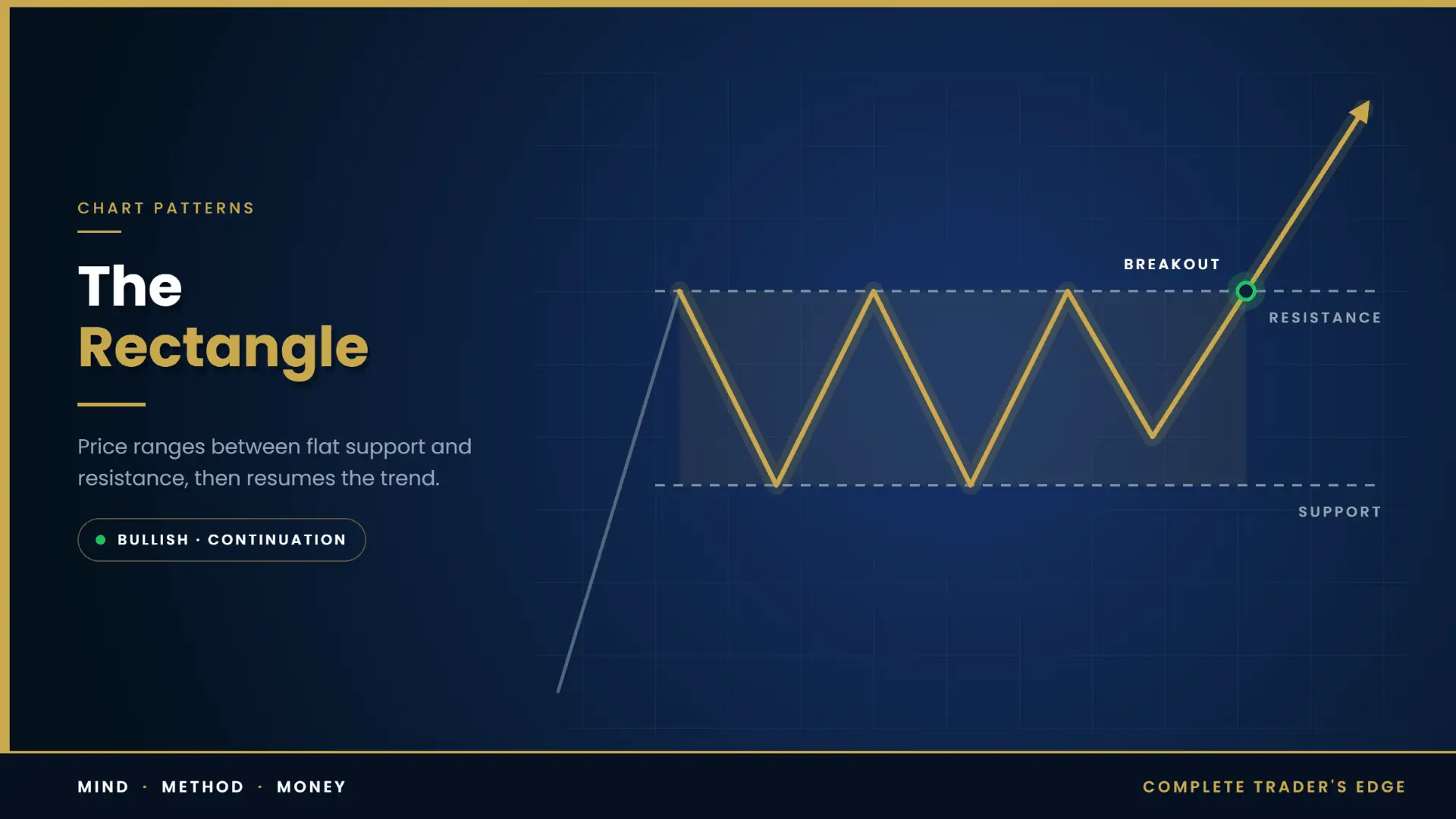
Price oscillates horizontally between two roughly parallel levels. Buyers defend the floor, sellers defend the ceiling, and neither makes progress. The formation can run for weeks or months.
What it represents. A rectangle is the purest visual expression of a market in balance. It is also the clearest picture of institutional accumulation or distribution you will get from a price chart alone. A participant who needs to build or unload a position far larger than the available liquidity cannot do it in one move without destroying their own price. They work the order over time, absorbing supply near the floor or feeding stock into demand near the ceiling. The result is a range that refuses to break while the work is being done.
Why it performs. Three structural advantages. The boundaries are flat, so there is no ambiguity about where the level sits – unlike a trendline, which two traders will draw two ways. Invalidation is precise, which means position sizing is precise. And the range itself concentrates resting orders on both sides, so a genuine break moves into thin liquidity.
How to trade it. Wait for a close beyond the boundary on your trading timeframe. The measured objective is the height of the range projected from the break. The retest entry is usually better than the break entry, because rectangles produce a high rate of return-to-boundary moves after the initial break. Stop goes back inside the range, not at the boundary.
One tell worth knowing: if price leaves one boundary and turns before reaching the opposite one, that partial move often precedes a break in the direction of the turn. Participants who are unwilling to wait for the better price are showing their hand.
Rectangles are the same structure that Wyckoff method analysis calls an accumulation or distribution schematic, and the same structure that stage analysis calls Stage 1 and Stage 3. Three vocabularies, one phenomenon.
2. Head and Shoulders Continuation – 60.9% (184 occurrences)
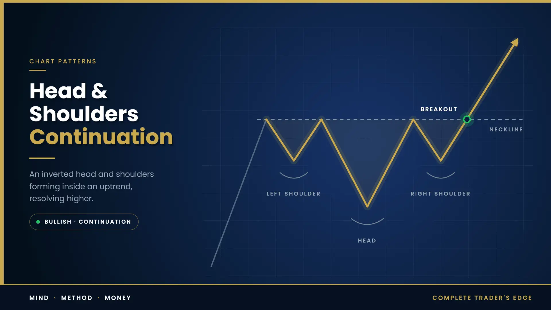
The geometry of a head and shoulders, but appearing inside a trend rather than at its end, and resolving in the direction of the existing trend rather than against it.
What it represents. A deep, messy pullback within a larger move. Three swings of a correction, with the middle one the most extreme. When the correction ends and the trend resumes, the shape is left behind on the chart looking like a failed reversal – because in a sense that is exactly what it is.
Why it performs better than the topping version. This is the most instructive comparison in the whole table. Same geometry, 60.9% versus 47.2%. The difference is not the shape. The difference is trend alignment. When the formation resolves with the dominant flow, it works substantially better than when it resolves against it.
That single comparison is worth more than any individual pattern statistic in this article. It says that context dominates geometry. You can learn every formation in the encyclopedia and still lose money if you consistently take them against the higher timeframe direction.
How to trade it. Identify the dominant trend first, on a timeframe at least one degree above your entry chart. Only then look at the formation. If the shape implies a reversal but the higher timeframe is strongly trending the other way, the balance of probability favours the trend, and the bearish-looking structure becomes a continuation setup once the neckline holds and price breaks back out with the trend.
3. The Ascending Triangle – 58.7% (329 occurrences)
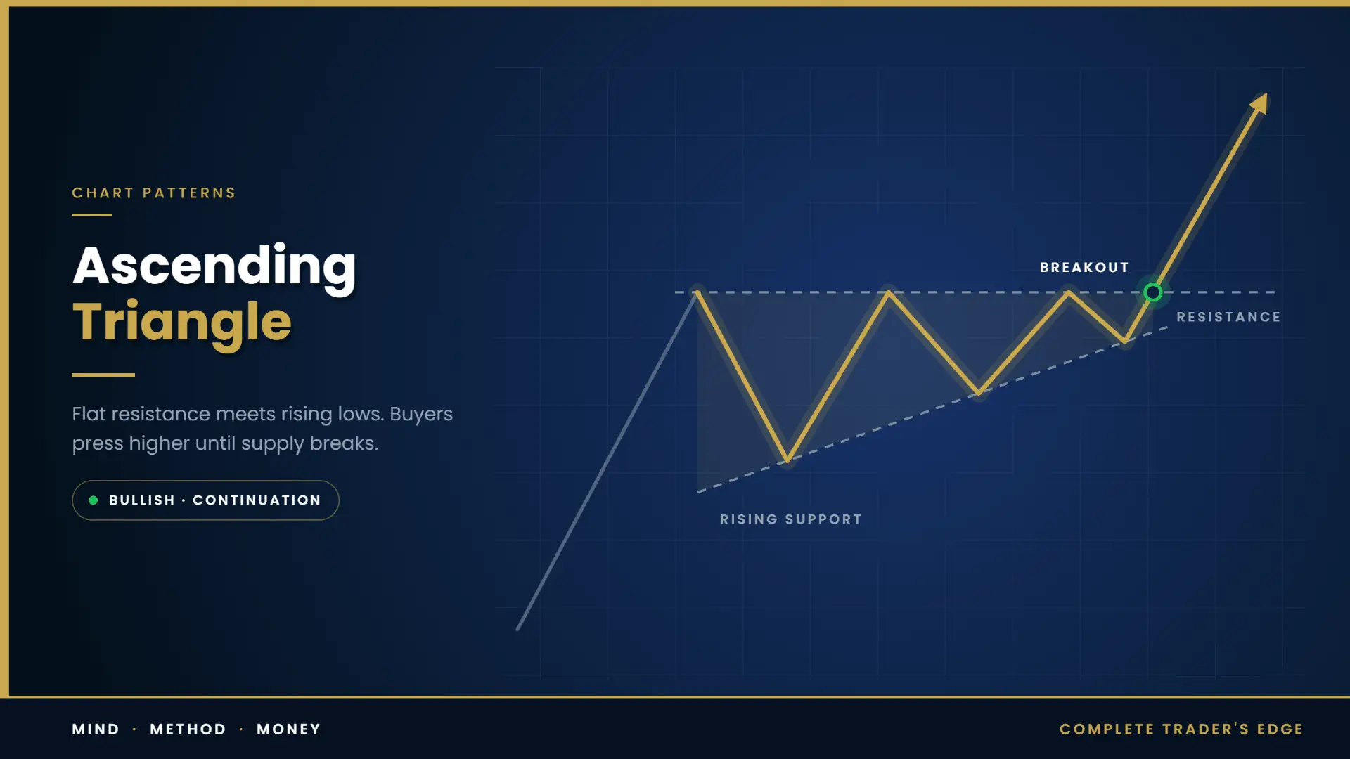
A flat horizontal ceiling with a rising floor. Each pullback finds buyers earlier than the last.
What it represents. A supply block at a fixed price meeting demand that is becoming progressively more urgent. Someone is selling a defined quantity at a defined level. Buyers are increasingly unwilling to wait for a discount. The compression continues until the supply at the ceiling is exhausted.
What sits above the ceiling. A flat resistance line touched three or four times is, in liquidity terms, a shelf of stop orders from everyone who sold the level, plus buy-stop entry orders from every breakout trader watching the same chart. That is a dense pool of resting orders in a narrow price band. When the supply finally clears, price does not glide through it – it accelerates, because the orders above feed on each other. This is the mechanical reason ascending triangle breakouts tend to be fast.
How to trade it. The strongest versions break somewhere in the middle two-thirds of the formation’s length rather than drifting into the apex. A triangle that compresses all the way to the point has usually lost the energy that made it interesting. Volume should contract through the formation and expand on the break. Measured objective is the height of the triangle at its widest, projected from the breakout.
4. The Symmetrical Triangle – 57.2% (173 occurrences)
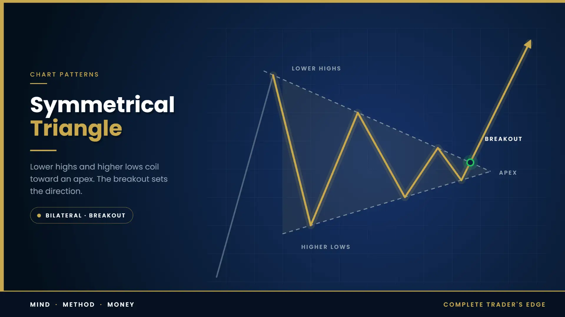
Lower highs and higher lows converging toward each other. Neither side is winning.
What it represents. Genuine two-sided uncertainty, usually ahead of a catalyst. Volatility compresses as the market waits for information neither side has yet.
The discipline it demands. This is a bilateral pattern. It does not tell you direction. The single most common error is deciding in advance which way it will break because you have a view, then taking the trade early when price approaches your preferred boundary. If you cannot trade it in both directions with equal willingness, you should not trade it at all.
What it does tell you, reliably, is that a volatility expansion is coming. That is tradeable on its own terms – it tells you to have both orders ready, to have size calculated, and to expect a fast move. Volatility contraction preceding expansion is one of the more durable structural regularities in markets.
How to trade it. Bracket it, or wait for the close beyond one side and trade the retest. In the absence of any other information, the direction of the trend into the formation is the better prior. Failed breaks are common enough that the retest entry is worth the occasional missed move.
5. The Cup and Handle – 56.9% (232 occurrences)

A rounded, U-shaped base, followed by a shallow drift lower that forms the handle, then a break above the handle’s resistance. Popularised by William O’Neil.
What it represents. The cup is an orderly transfer of ownership. Price declines without panic, bottoms gradually, and recovers – a slow rounding that indicates holders who wanted out have gone, and the remaining supply is in firmer hands. The handle is the final shakeout: a modest pullback that removes the impatient before the advance.
What makes a good one. The U-shape should be smooth rather than a sharp V – a V-bottom means panic and capitulation, not orderly transfer, and the base has not done its work. The handle should be shallow relative to the cup, and volume in the handle should dry up noticeably. A handle that retraces most of the cup’s right side is not a handle; it is a failed recovery.
How to trade it. Entry on the break of the handle’s resistance line. Stop below the handle low. Objective is the cup’s depth projected from the breakout. Because the formation takes months to build, it is a swing and position structure rather than an intraday one.
6. Head and Shoulders Bottom – 56.7% (141 occurrences)
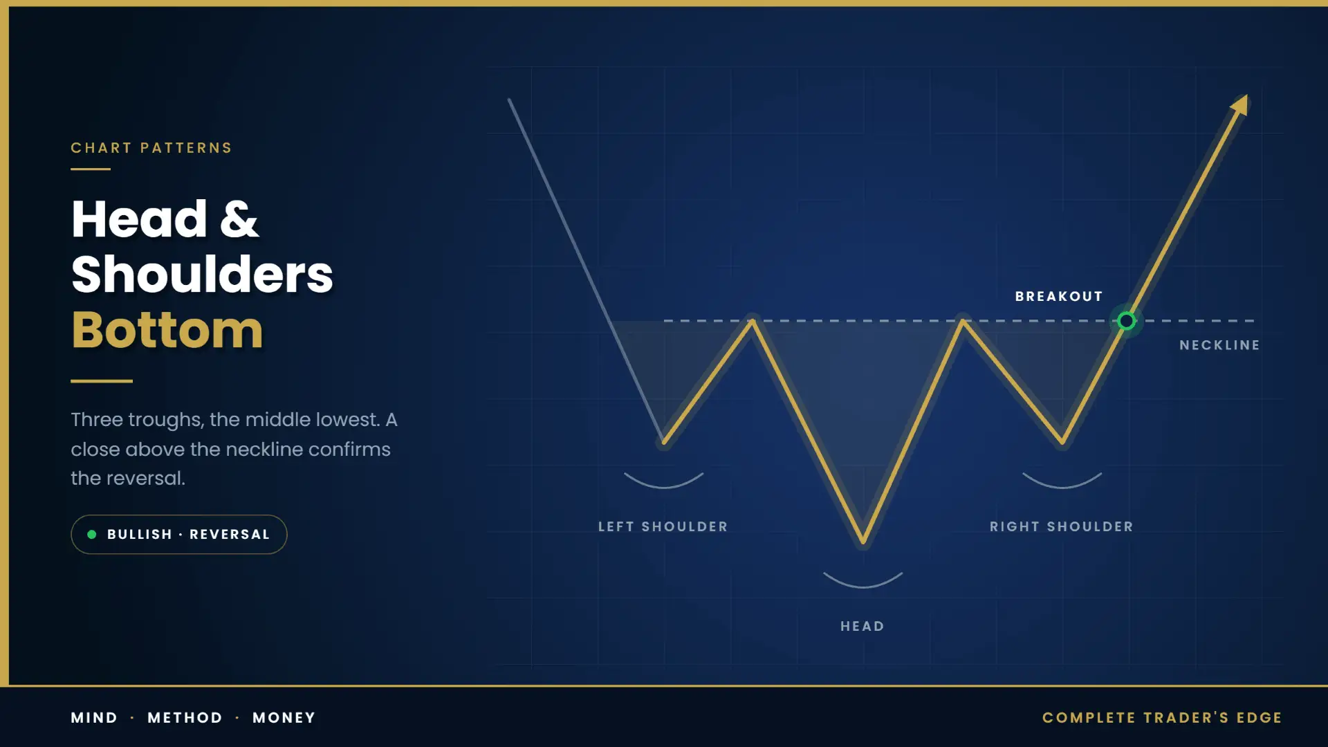
Three troughs, the middle one deepest, with a neckline across the intervening highs. The inverse of the classic top.
What it represents. Sequential exhaustion of supply. The first low is driven by genuine selling. The second and deeper low fails to attract follow-through. The third is shallower still, because the sellers who wanted out at these levels have already gone. Each successive low takes less selling to produce, which is the definition of a market running out of sellers.
Why it outperforms the top by nearly ten points. Partly the same trend-alignment logic as the continuation version – equity markets drift upward over time, so a bullish reversal is swimming with the long-run current. Partly a structural asymmetry: accumulation is slow and visible, whereas distribution can happen fast and invisibly through derivatives and dark pools. Bottoms take longer to form and leave clearer footprints.
How to trade it. Require a close above the neckline. The right shoulder low is the natural stop. Objective is the distance from the head to the neckline, projected upward. Watch for the neckline retest – it is common and offers a better entry than chasing the break.
The head and shoulders guide covers both orientations in depth.
7. The Descending Triangle – 51.0% (49 occurrences)
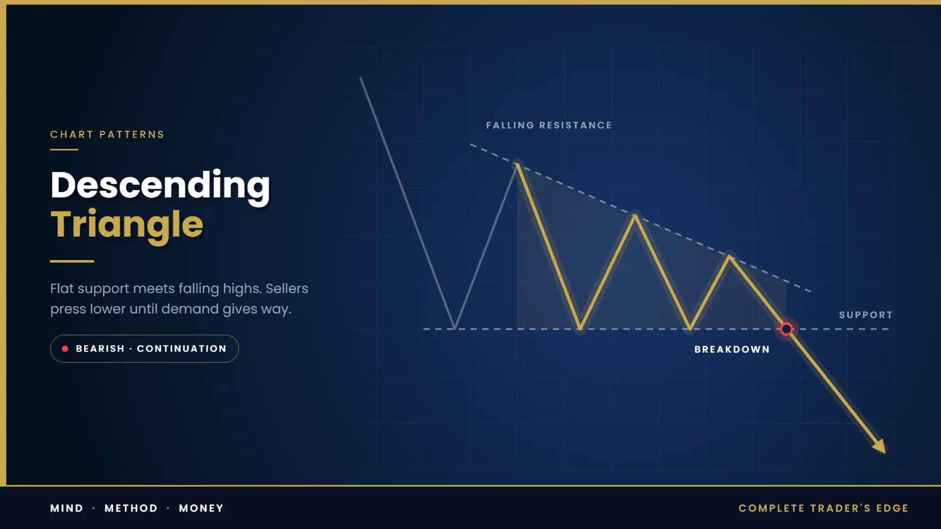
A flat floor with a descending ceiling. Textbooks call it bearish. The data is far less certain than the textbooks.
The problem with the textbook reading. A horizontal support level that holds repeatedly while highs come down is described as sellers overwhelming buyers. But the identical geometry also describes a buyer absorbing supply at a fixed price while the market grinds lower around them. Those are opposite interpretations of the same picture, and price action alone cannot separate them. Broader pattern research has repeatedly found that descending triangles break upward more often than the classical reading would predict.
What this means practically. 51.0% on 49 occurrences is, statistically, indistinguishable from a coin flip. The honest conclusion is not that descending triangles are bearish or bullish; it is that the formation on its own carries very little directional information and should not be traded on its geometry alone.
How to trade it. Treat it as bilateral until the higher timeframe or the order flow tells you otherwise. If you have independent reason to be short – trend, supply zone, relative weakness – the formation gives you a clean level and a tight invalidation. Without that independent reason, the shape is not a thesis.
8. The Head and Shoulders Top – 47.2% (53 occurrences)
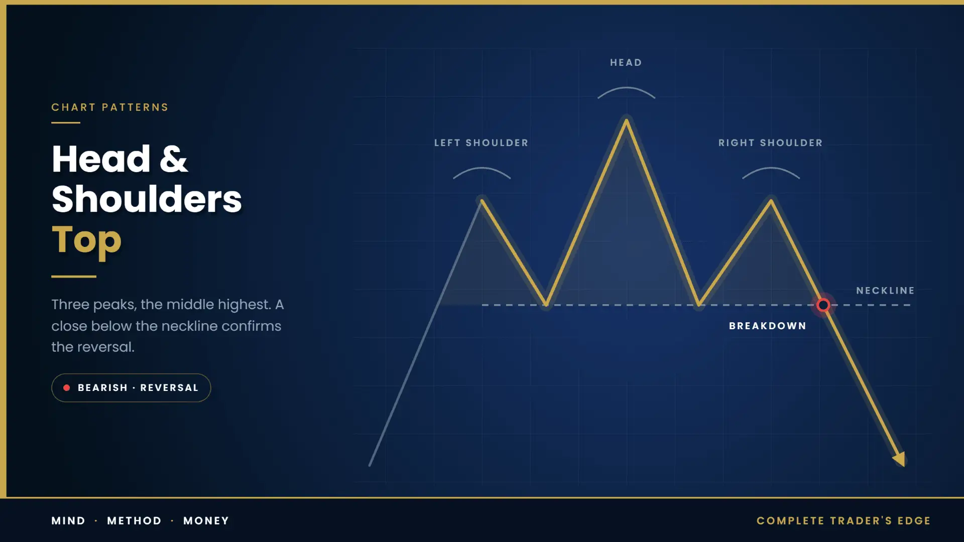
Three peaks, the middle highest, with a neckline connecting the intervening lows. The most famous pattern in technical analysis, and the weakest performer in the dataset.
Why the gap between reputation and results. Several reasons compound.
It is a counter-trend trade, so you are positioning against the flow that has been paying everyone else. It is also the most universally recognised formation in trading, which means the stops are in the most predictable place on the entire chart – immediately above the right shoulder. And a neckline is a drawn line, which introduces exactly the discretion that flat-boundary patterns avoid. Two traders will place it differently and get different entries and different results from the same chart.
There is also a sampling issue worth naming: tops are relatively rare in a dataset drawn from equity markets over a period that contained more advance than decline. Fifty-three occurrences is not many, and the confidence interval around 47.2% is wide. The defensible statement is that the head and shoulders top is not the high-probability structure its reputation implies – not that it is a losing pattern.
How to trade it. Demand more than usual. A close below the neckline, not a wick. Declining volume through the right shoulder. Confirmation from the higher timeframe that the trend is genuinely in trouble rather than correcting. And accept that the right shoulder will frequently overshoot the left shoulder before rolling over, because that is where the liquidity is.
The pattern is not the edge. A fifteen-point spread across eight formations means pattern selection is a small lever. Trend alignment, entry quality, stop placement and position size are large levers. Traders who obsess over which pattern to trade are optimising the smallest variable in the equation.
The Patterns Worth Knowing About and Avoiding
Several well-known formations did not make the eight, and a few deserve a specific warning.
The rising wedge is the one to be most careful with. Two upward-sloping converging lines, conventionally read as bearish. It is consistently ranked at or near the bottom of large-scale pattern performance studies for bearish setups. Downside breaks frequently fail to travel, and the rate at which price recovers back through the broken line is high. Shorting a rising wedge on the break is one of the less rewarding things you can do with a chart. The more interesting trade is often the failure – when the breakdown does not follow through and price reclaims the structure, the trapped short positions become fuel.
The falling wedge is a better performer than its mirror, for the familiar reason: it is a bullish structure in markets with an upward drift. Treat it with more respect than the rising wedge, but still demand confirmation.
Broadening formations and diamonds are real but are difficult to trade. Both involve expanding volatility, which means the invalidation level moves away from you while the formation develops. A structure whose stop widens as it matures is a structure whose position size must shrink as it matures, which is the opposite of what most traders do.
Flags and pennants are absent from the table because they are short-duration structures and the dataset covered patterns of two to twenty-four months. They remain among the most useful continuation formations on intraday and swing timeframes. Covered separately in the flags and pennants guide.
Double tops and bottoms are likewise not in this particular dataset but are structurally important, especially through a liquidity lens, where a double top is simply a pair of equal highs with stops resting above them. See the double top and double bottom guide.
Confirmation: The Breakout Is the Trade
If you take one operational rule from this guide, take this one. The pattern does not give you a trade. The break of the pattern gives you a trade, and how you define “break” determines most of your results.
A wick through a level is not a break. Price spending four minutes beyond a boundary is not a break. The standard that survives contact with real markets is a close beyond the level on the timeframe you are trading, and for higher-timeframe structures, a close beyond it on the timeframe the structure was built on.
This single definitional choice filters out an enormous share of what traders experience as pattern failure. Boundaries of well-formed patterns are precisely where liquidity concentrates, which makes them precisely where a temporary probe beyond the level is most likely. A trader entering on the touch is taking the worst available version of the trade.
Volume
Volume is the second filter, and on instruments where you have reliable volume data it is close to mandatory.
Through the formation of a consolidation structure – triangle, rectangle, pennant, handle – volume should contract. That contraction is the visible signature of participation draining out of the range. On the break, volume should expand materially. A breakout on thin volume means the move is not being funded by new participants, and thin-volume breaks return into the range at a much higher rate.
On futures, use actual traded volume. On spot FX, tick volume is a rough proxy for activity but not for size, and should be weighted accordingly. Volume profile gives you something better than raw volume on any instrument that offers it: it shows you where the range built value, which tells you which boundary the market actually cares about.
Throwbacks and Pullbacks
After a break, price very often returns to retest the broken boundary. Upward breaks throw back; downward breaks pull back. This is normal, it is frequent, and it destroys traders who set stops immediately behind the boundary.
Two ways to handle it. Either enter on the break with a stop placed with enough room to survive a retest – which means a smaller position – or skip the break entirely and enter on the retest with a tight stop and a larger position. The second is usually the better trade and occasionally means missing the move. The break and retest strategy covers the mechanics.
What you must not do is enter on the break with a tight stop behind the boundary. That combination is the worst of both, and it is what most traders default to.
Measured Moves, and What “Reaching the Objective” Means
Every classical pattern has a measured move: take the height of the formation and project it from the breakout point. The head-to-neckline distance for head and shoulders. The range height for a rectangle. The widest part of the triangle. The cup depth for a cup and handle.
The 59.6% figure is the rate at which price reached that objective. Which means two things worth separating.
First, a pattern can confirm, travel usefully, and still be scored a failure because it stopped short of the full projection. If you take partial profit at half the measured move, your realised hit rate on a partial basis is higher than the headline number.
Second, the measured move is a statistical tendency, not a price target the market has agreed to. Treat it as a zone where a reaction becomes more likely, and give it more weight when it coincides with something independent – a prior swing high, a higher-timeframe supply zone, a Fibonacci extension, a session level. Confluence between a pattern target and an unrelated structural level is worth considerably more than the target alone.
Regime: The Variable That Overrides the Pattern
Pattern performance is not stable across market conditions, and the variation is larger than the variation between patterns.
In a strong directional regime, continuation patterns resolve cleanly and reversal patterns fail repeatedly. In a choppy, mean-reverting regime, breakouts of every kind fail at a much higher rate because the market is systematically punishing momentum. The same ascending triangle, with identical geometry and identical volume behaviour, has materially different odds depending on which of those environments you are in.
This is the practical content of the 47.2% versus 60.9% comparison between the two head and shoulders variants. It is not a statement about geometry. It is a statement about which way the water is flowing.
Before you take any pattern trade, answer one question: is this instrument trending or ranging on the timeframe above the one I am trading? In a trend, take continuation patterns and treat reversals with suspicion. In a range, take reversals at the extremes and treat breakouts with suspicion. Regime identification is upstream of everything in this article.
Timeframe
The dataset behind the table covered formations lasting two to twenty-four months. Those are position-trade structures on daily and weekly charts, and their reliability does not transfer down to a five-minute chart unchanged.
Higher-timeframe patterns are more reliable for a structural reason rather than a mystical one: they contain more participants, more capital, and more accumulated resting orders, so the levels they define are defended by real interest rather than noise. A daily rectangle on a liquid instrument represents months of genuine two-sided business. A five-minute rectangle represents forty minutes of algorithmic quoting.
Patterns on lower timeframes are still tradeable. They simply require more confirmation, produce more failures, and should carry smaller size relative to account risk.
Busted Patterns: When Failure Is the Signal
A pattern is busted when it confirms, fails to travel, reverses, and breaks out through the opposite boundary. It is one of the most important second-order concepts in pattern trading, and it follows directly from the mechanics of where stops sit.
Consider a textbook head and shoulders top on a widely watched instrument. It is the most recognisable formation in trading. The neckline breaks. Every discretionary trader who reads charts, plus every algorithm coded to detect the structure, goes short. Their stops go in the one obvious place: above the right shoulder.
That is now a dense cluster of buy orders sitting in a known location. If a participant with size wants to buy, they have just been handed a map. Price is driven back above the right shoulder, the shorts are stopped out, the forced buying accelerates the move, and a reversal pattern becomes the launchpad for a continuation.
The failure is not random. It is a consequence of the pattern being visible.
A well-formed pattern that fails decisively frequently produces a stronger move than the same pattern working. The trapped positions are the fuel. If you are going to trade patterns at all, you need a plan for what you do when yours breaks – because that scenario is often more tradeable than the one you wanted.
Practically: when a confirmed breakout reverses and closes back inside the formation, treat that as an event rather than as noise. It is information about who is actually in control, and the resulting move in the opposite direction has a clean invalidation level – the extreme of the failed break.
The Smart Money Lens
Classical charting and modern smart money concepts describe the same market mechanics in different vocabularies. Once you see the translation, both get more useful.
| Classical structure | The same thing in liquidity terms |
|---|---|
| Rectangle | Accumulation or distribution range. Equal highs and equal lows on both boundaries; liquidity pools on each side. |
| Ascending triangle ceiling | Equal highs. A shelf of buy-side liquidity sitting in a narrow band. |
| Double top | Two equal highs. The second test is frequently a sweep of the first, not a breakout attempt. |
| Neckline break | Break of structure. The point at which the swing sequence formally changes. |
| Flag or handle | Retracement into an order block or imbalance left by the impulse. |
| Busted pattern | Liquidity sweep using a widely recognised formation as the bait. |
What the liquidity vocabulary adds is a mechanism. Classical charting tells you a head and shoulders top tends to precede a decline. The liquidity reading tells you why the right shoulder so often overshoots the left before rolling over: the stops of everyone who shorted the left shoulder are sitting just above it, and those orders have to be filled by someone.
That reframes an event most traders experience as a pattern failing. A slight overshoot that immediately reverses is not the pattern breaking. It is the pattern working, with the liquidity collected first.
Useful companions here: what liquidity actually is, fair value gaps, and market structure.
How to Actually Trade a Chart Pattern
A checklist you can apply to any formation in this guide. If a setup fails more than one of these, pass on it.
- Establish the regime first. Trend or range, on the timeframe above your entry chart. This decides whether you are hunting continuation or reversal, and it overrides the pattern.
- Require a clean structure. At least two touches on each boundary. If you are adjusting your lines to make the shape work, the shape is not there.
- Define the break before it happens. Which timeframe, closing basis, and what price invalidates the idea. Written down, not decided in the moment.
- Check volume behaviour. Contraction through the formation, expansion on the break. Where volume is unavailable or unreliable, demand more from the other filters.
- Prefer the retest. Better entry, tighter invalidation, and it filters the breaks that were never real. Accept that you will miss some moves.
- Size from the invalidation, not from conviction. Stop distance determines position size. A wide pattern means a small position. This is not negotiable, and it is the step that gets skipped.
- Know the target and the failure trade. The measured objective, whether it coincides with anything independent, and what you do if the breakout reverses. Plan both branches before entering.
The Honest Counterweight
Six in ten is an edge. It is not a system, and a trader can lose money steadily with a 60% hit rate.
Consider what the number does not contain. It says nothing about how far the 40% travel against you before they are cut. A strategy that wins 60% of the time and loses more per loss than it makes per win is a losing strategy. The dataset measures whether patterns reached their objective; it does not measure what a real trader netted after slippage, spread, commission and the unavoidable reality of exiting some winners early and holding some losers too long.
It also says nothing about your ability to identify the patterns in real time. The dataset was compiled by a chartered market technician publishing formations in advance under his own name. The rate at which an average trader correctly identifies a valid structure, on a live chart, with money at risk and an opinion already formed, is lower – possibly much lower. Hindsight makes every pattern obvious and every boundary clean.
And the sample is drawn from equity markets, long-duration formations, and a period that contained a historic bull market. Your instrument, your timeframe and your regime are all different.
None of that makes patterns useless. It makes them one input. Chart patterns are a way of organising what you see, defining risk precisely, and knowing in advance what would prove you wrong. That is genuinely valuable, and it is a smaller claim than the one usually made for them.
The traders who make money with patterns use them as structure, not as prophecy. The traders who lose money with them are looking for a shape that tells them what happens next. The broader evidence on whether technical analysis works tells the same story in a wider frame.
The Chart Pattern Library
Every formation in this guide has a dedicated breakdown with worked examples, entry rules and failure modes.
Classical formations
- Head and Shoulders: How to Trade It (and When It Lies)
- Triangle Patterns: Ascending, Descending and Symmetrical
- Rising and Falling Wedges: The Reversal Most Traders Get Backwards
- Double Top and Double Bottom: The Reversal Built on Liquidity
- Flags and Pennants: The Most Reliable Continuation Patterns
Candlestick structures
- Candlestick Patterns: The Complete Guide
- The Engulfing Candle: Footprint of a Structure Shift
- The Pin Bar: Trading the Rejection
- The Inside Bar: Trading the Coil
- The Doji: What It Really Signals
- Hammer, Shooting Star and Hanging Man
- Morning Star and Evening Star
Context and method
Frequently Asked Questions
What is the most reliable chart pattern?
On nine years of live breakout data covering 2,082 completions, the rectangle had the highest rate of reaching its measured objective at 62.4%, followed by the head and shoulders continuation at 60.9% and the ascending triangle at 58.7%. The spread between the best and worst of the eight patterns tracked was only about fifteen percentage points, which suggests pattern selection matters less than trend alignment, entry quality and risk management.
How accurate are chart patterns?
Across that dataset, 59.6% of confirmed breakouts reached their measured price objective. Figures of 80% or 90% circulating online generally come from studies using a different and much easier definition of success – typically whether price moved at least 5% after the breakout, rather than whether it reached the full projection. Compare definitions before comparing numbers.
Why does the head and shoulders top perform so badly?
It reached its objective 47.2% of the time in the live dataset, the lowest of the eight patterns tracked. Three reasons compound: it is a counter-trend trade, its stop placement is the most predictable on any chart, and the neckline is a drawn line rather than a flat level, which introduces discretion. The same geometry in the direction of the trend – the head and shoulders continuation – reached 60.9%.
Should I enter on the breakout or the retest?
The retest, in most cases. Breakout boundaries are where resting orders concentrate, which makes temporary probes beyond the level common. Entering on the retest gives a better price, a tighter invalidation and filters out breaks that were never genuine. The cost is missing the moves that do not come back.
Do chart patterns still work in algorithmic markets?
They still carry information, but reliability is inversely related to market efficiency – the deeper and more arbitraged the market, the faster a visible anomaly is competed away. Algorithms also detect the same formations, which reinforces some breakouts and makes the stop clusters behind them more exploitable. That is why false breaks and busted patterns are a bigger share of the picture than they were forty years ago.
Which timeframe should I trade chart patterns on?
Higher timeframes are more reliable because their levels are defined by more participants and more capital. The nine-year dataset covered formations lasting two to twenty-four months – daily and weekly structures. Lower-timeframe patterns are tradeable but need more confirmation and smaller size.
How many chart patterns do I need to learn?
Five or six is enough. Rectangles, triangles, head and shoulders in both orientations, flags and pennants, and double tops and bottoms cover the overwhelming majority of tradeable structures. Learning exotic formations adds complexity without adding edge – and the data shows the difference between the best and worst common patterns is small anyway.
What is a busted chart pattern?
A pattern that confirms, fails to travel, reverses, and breaks through the opposite boundary. It happens because the stops behind a recognisable formation sit in a predictable place, which makes them a target. Busted patterns often produce stronger moves than the original setup would have, because the trapped positions have to be covered.
From The Book
This article covers concepts from Chapter 33 of The Complete Trader’s Edge.
 The Complete Trader's Edge
The full Mind · Method · Money framework. 70 chapters.
View on Amazon →
The Complete Trader's Edge
The full Mind · Method · Money framework. 70 chapters.
View on Amazon →
 Market Mayhem
400 years of bubbles, crashes, and the pattern that keeps repeating.
Buy on Amazon →
Market Mayhem
400 years of bubbles, crashes, and the pattern that keeps repeating.
Buy on Amazon →
 Greatest Companies
How the world's greatest companies were built — and what traders learn from them.
View on Amazon →
Greatest Companies
How the world's greatest companies were built — and what traders learn from them.
View on Amazon →
 Greatest Traders
Eighty-six lives that explain the markets — Livermore to Madoff, told with the losses left in.
View on Amazon →
Greatest Traders
Eighty-six lives that explain the markets — Livermore to Madoff, told with the losses left in.
View on Amazon →